Telstra Health

Putting health information at people’s fingertips

Project summary

In 2022, the NCSR embarked on an initiative to upgrade and enhance its web presence due to poor user experience, lack of authoring flexibility and a need to realign with the brand image.

User testing participants had difficulty understanding the NCSR site, expressing that although it contained quality content, it was not well organised, presenting a barrier to the easy access of information.

Authors found the existing site cumbersome and difficult to update, impacting the time required to add to or edit the site content.

Noice was engaged to update the information architecture and user experience, create a new design system that aligned with the NCSR brand and implement a modern, future-proof authoring experience using Adobe Experience Manager 6.5.

About the client

The National Cancer Screening Register (NCSR) is a single electronic record for each Australian taking part in the bowel and cervical screening programs.

It supports these life-saving programs by inviting and reminding eligible people to screen, as well as creating a safety net by prompting participants and their healthcare providers to take the next steps on their screening journey.

Key NCSR stakeholders include the Department of Health and Telstra Health.

Quote
“One of the key strengths of our collaboration was the clear and consistent communication between our teams. Their prompt responses and willingness to address any concerns or queries helped establish a strong sense of trust and ensured we were always on the same page throughout the project's duration.”
Author
Communications Lead, Telstra Health
Tag
Communication and collaboration
Heading
Setting the stage for success
Subheading
From the outset of the project, we prioritised establishing transparent and effective communication channels.
Content
The project members across Noice and NCSR defined an agreed-upon ‘ways of working’ framework that ensured that all stakeholders had real-time access to project updates and deliverables, as well as being able to easily communicate changes to our team.

This facilitated a seamless workflow, encouraged collaborative problem-solving and helped maintain alignment with the project’s objectives throughout its duration.

Our collaborative approach and built-in flexibility allowed us to adapt to changes swiftly and efficiently. This flexibility not only allowed us to meet deadlines but also to delivery high-quality results that exceeded expectations.

Technical implementation and challenges

Leveraging Adobe Experience Manager as the CMS, we successfully addressed challenges including legacy systems integration and content migration.

Components were developed using the latest Adobe framework, ensuring a seamless experience for content authors.

Quote
“The major challenges were related to the complexity of integrating AEM… expertise and proactive problem-solving approach helped address complexities promptly.
Author
Communications Lead, Telstra Health

Componentised, drag-and-drop editing

AEM Core Components were used across the entire site, with AEM Style System integrated to provide a clear, consistent and easy to understand authoring experience.

Page templates were created for key user journeys, and we worked closely with authors to ensure that rework was not necessary for common layouts and experiences.

Easy-to-use custom form builder

Noice built a fully accessible custom form builder system, allowing connectivity to external APIs, complex validations and layouts without deviating from the simple AEM authoring experience.
Quote
Quote Author
Image
Tag
User experience enhancement
Heading
Uplifting the homepage
Heading Emphasis Text
homepage
Subheading
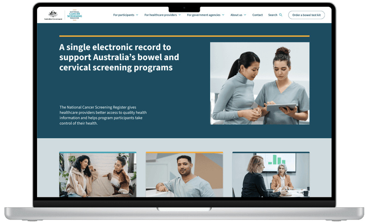
Users were not clear how the National Cancer Screening Register, its website and its portals could benefit them in a practical way due to lack of messaging on the homepage.
Content
An expanded homepage provides more opportunities for clearer, more informative and up-to-date messaging. Hero content is followed by content that ‘peeks’ above the fold to encourage users to scroll down the page.
Button 1 Text
Button 1 Link URL
Button 2 Text
Button 2 Link URL
Quote
Quote Author
Image
Tag
User experience enhancement
Heading
Clearer wayfinding
Heading Emphasis Text
wayfinding
Subheading
Users found it difficult to locate certain content, such as videos and guides. The only method of page navigation disappeared when users scrolled too far down a long page.
Content
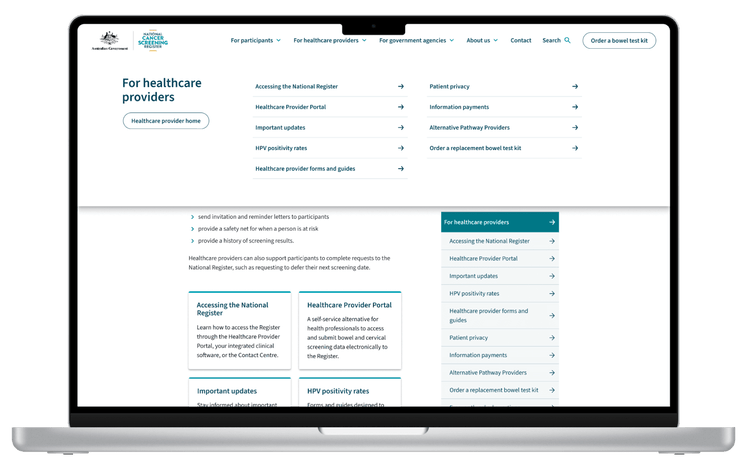
A persistent top navigation corresponds to the website’s audience segments, allowing users to wayfind anywhere in the site. Hub pages and side navigation provide users multiple ways of getting to the content that they are looking for.
Button 1 Text
Button 1 Link URL
Button 2 Text
Button 2 Link URL
Quote
Quote Author
Image
Tag
User experience enhancement
Heading
Reduced cognitive load
Heading Emphasis Text
cognitive load
Subheading
Healthcare professionals felt that there was too much information on the page to properly read and digest.
Content
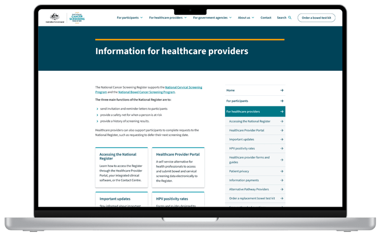
Content is grouped by topic and separated from the main ‘hub’ pages, reducing cognitive load and improving scannability. Duplicated content has been consolidated, making it easier for users to be sure they’re in the right place.
Button 1 Text
Button 1 Link URL
Button 2 Text
Button 2 Link URL
Cut through the noise